Easy bank
Introduction
The Brief
"Could you check my balance for me, please? I've rung twice and still haven't got through."
We heard that more than once during early research at a local branch. The bank already had a feature-rich mobile app — but it wasn't reaching everyone.
The brief came from within the bank's own IT team. Not to overhaul the main app, but to build a simpler companion for senior customers: people who preferred in-person banking but were willing to try digital, as long as it didn't feel intimidating. We had 8 weeks to ship an MVP.
The Problem We Were Actually Solving
Branch footfall was high. Call centre queues were long. And a large segment of long-time customers was being left behind by digital transformation — not because they lacked smartphones, but because they lacked confidence.
We reframed early: this wasn't a technology gap. It was a trust gap.
Research: What We Heard at Branch Level
We spoke directly to customers at branches, shadowed call centre agents, and reviewed support logs. Four patterns emerged clearly:
- Login friction — Password rules were too complex; recovery was worse
- Single-device lockout — Partners and family couldn't share access
- No spending visibility — Users described money "just disappearing"
- Slow, cluttered apps — Existing apps loaded slowly under banners and promotional offers
The clearest signal: most in-person visits and calls were avoidable with the right tool.
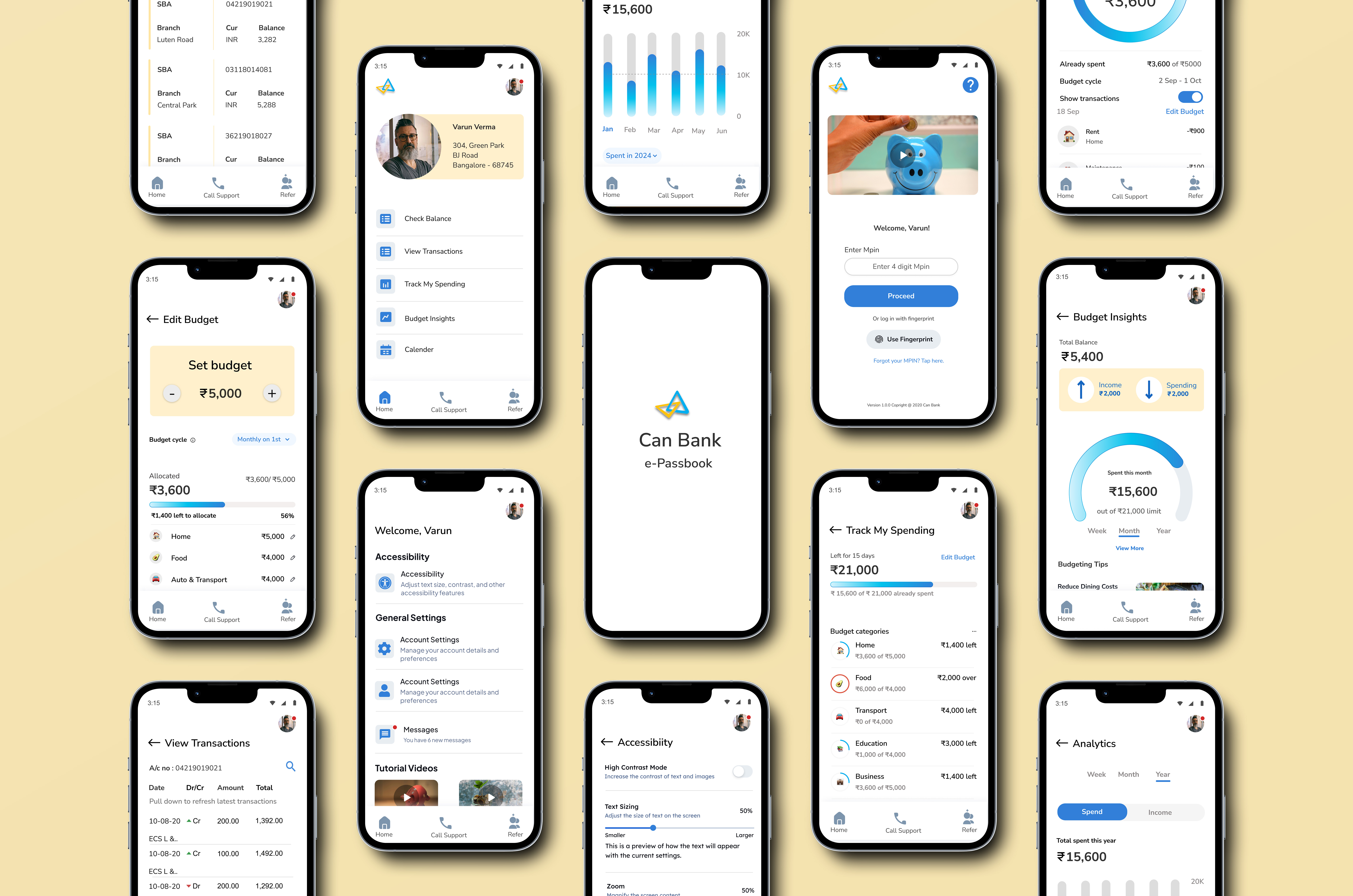
What We Built
We designed around three user types — senior primary users, family members who shared devices, and first-time digital users — keeping seniors firmly at the centre.
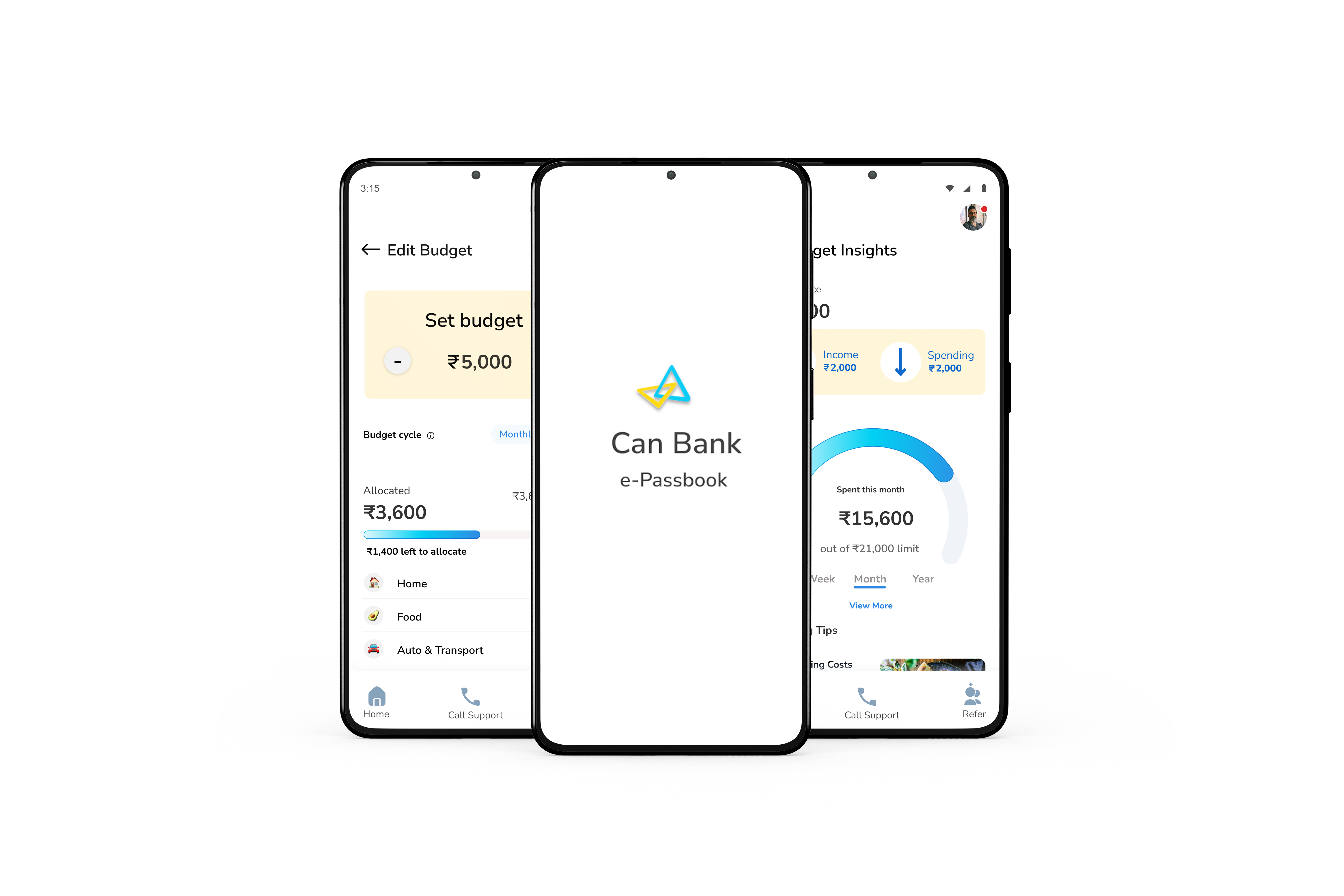
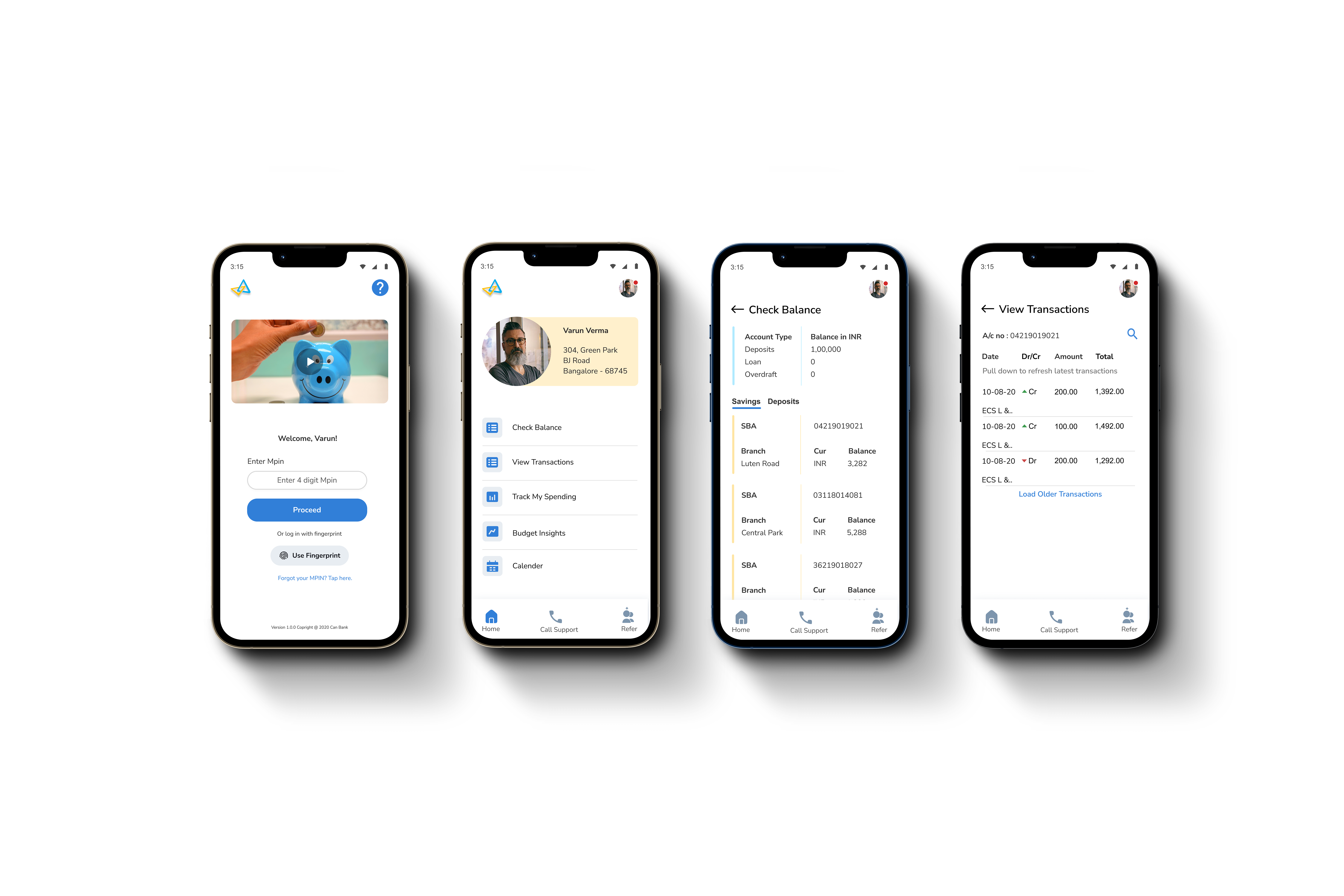
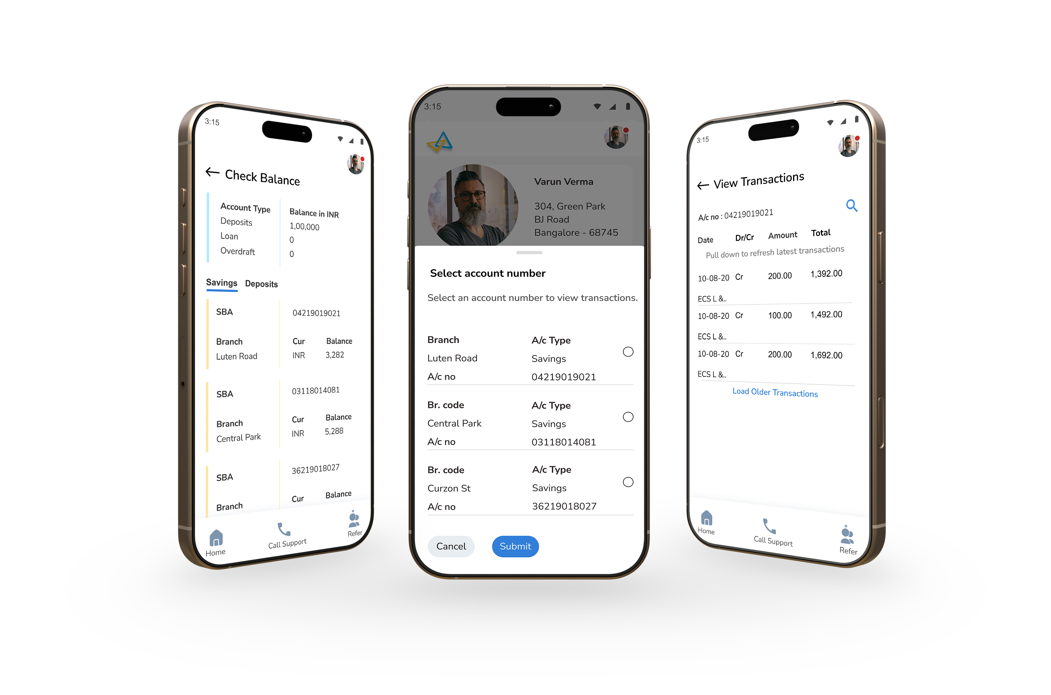
Calm home screen
Five clearly labelled actions, stacked vertically. No carousels, no promotional banners. Plain language throughout — "View Transactions" not "Statement", "Track My Spending" not "Ledger." One job: help users feel in control.
MPIN + fingerprint login
We A/B tested three methods — alphanumeric password, 4-digit MPIN, and fingerprint. MPIN and fingerprint won decisively. Fast, secure, nothing to forget. Passwords were dropped entirely.
Shared Trust Access
One of the most repeated questions in interviews: "Why can't my partner check the balance too?" We built a read-only secondary access feature — a spouse, adult child, or caregiver could view balance and transactions. The primary holder gets a notification on every access and can revoke it at any time.
Budgeting without jargon
Users didn't want financial tools — they wanted visibility. Budget screens used plain category names ("Food", "Utilities"), visual spending cues, and gentle nudges. Pen-and-paper logic, digital execution.
Testing & What We Fixed
25+ participants aged 55–70. Think-aloud protocols. Real-world tasks like "check your last 3 transactions" or "set a grocery budget."
SUS score moved from 58 → 84 across three iterations.
Key fixes that came directly from testing:
- MPIN setup screen lacked digit guidance → added helper text: "Enter a 4-digit MPIN"
- Debit and credit transactions looked identical → introduced colour-coding and visual indicators
- Error messages like "Invalid credentials" caused self-blame → rewritten to: "That didn't work. Please check your MPIN and try again."
- Help options were overlooked when users were frustrated → "Call Support" made persistent across screens
- Icons too small for reduced dexterity → minimum tap target raised to 48×48px, labels added to all icons
What It Became
3M+ downloads. 4.7 stars on the Play Store. Balance-related branch calls dropped 25%. In-person walk-ins fell by 20%. 90% of users completed common banking tasks without any outside help.
But the number that mattered most internally was the SUS score moving from 58 to 84 — because that meant the design was earning confidence, not just downloads.
And that was always the real goal. Designing for senior citizens isn't about simplifying — it's about understanding the rhythms of their lives, their unspoken hesitations, and earning trust one small decision at a time. Most of our users didn't want full digital banking. They just wanted to feel in control of their money.
"If it's too complex, I'm out of here."
— Lata, 58
We kept her in mind at every step. Turns out, designing for Lata made it better for everyone.
(Project Gallery)
People's Dashboard