People's Dashboard
The Problem
S&P Capital IQ Pro is built for professionals making high-stakes financial decisions — investment bankers, private equity analysts, corporate development teams. For these users, information isn't just useful. It's the basis of million-dollar calls.
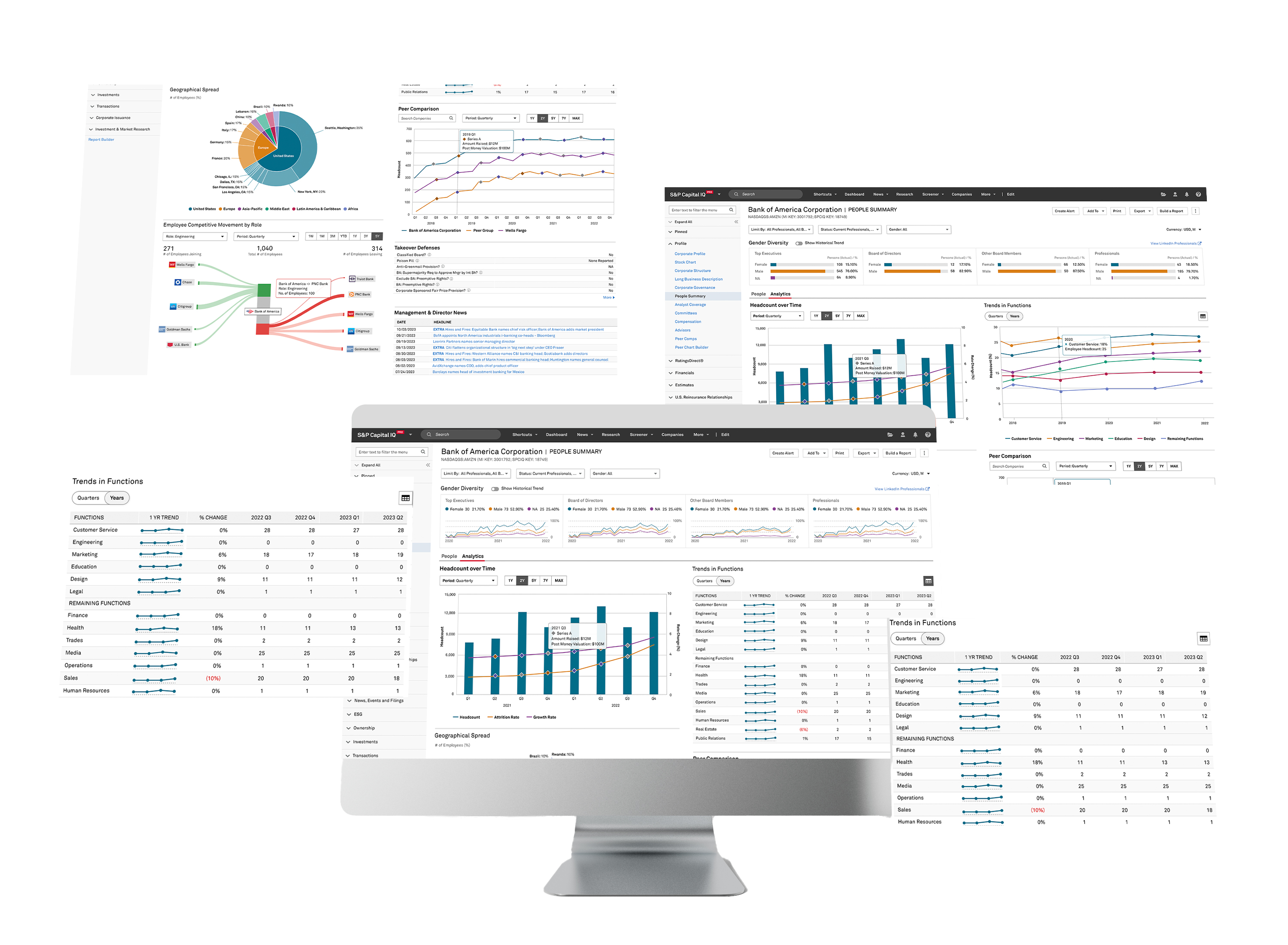
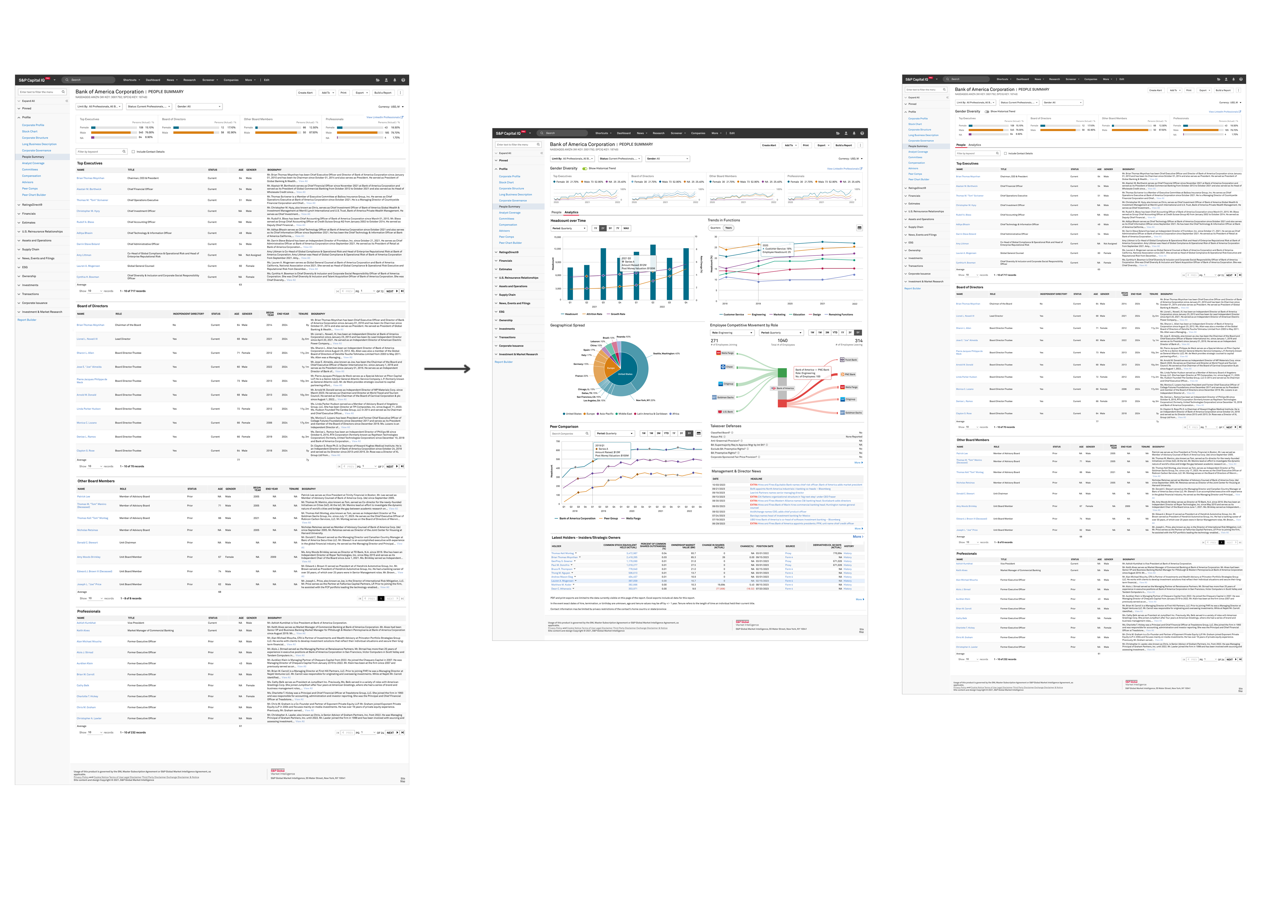
The People Summary page told you who was running a company. Executive bios, board composition, leadership tenure — cleanly surfaced. But the moment a user needed to go deeper, it fell short.
Because the questions that actually drive decisions aren't about who's at the top. They're organisational:
- Is headcount growing or quietly contracting?
- Which functions are being invested in — and which wound down?
- Where is talent coming from, and where is it going?
Users were left stitching answers together from LinkedIn, news searches, and third-party tools. Meanwhile, People Data Labs — a vendor with headcount and talent analytics across 29M+ profiles — was available but untapped.
The data existed. It just wasn't where people needed it.
The Work
As lead designer, I owned the experience end-to-end — from early concept through to final implementation — running working sessions across product, engineering, and data teams over three weeks.
The process was deliberately user-centred. We ran job story workshops with internal stakeholders to ground every design decision in real analyst behaviour, then moved quickly through collaborative sketching, rapid prototyping, and iterative feedback loops. No visualisation made it in without earning its place.
The redesign introduced a two-tab structure — an Analytics View for trends and a People View for individual depth — giving users a clear mental model from the start. Key additions included a redesigned top ribbon consolidating filters and surfacing gender diversity trends at a glance, an interactive pie chart showing global headcount distribution (we explored heatmaps and honeycomb charts before landing here), role-based headcount trend lines focused on the data that mattered most to stakeholders, and a peer comparison chart annotated with funding rounds to add strategic context.
The most complex piece was a Sankey diagram tracking employee movement across the top five competitors for any selected role — a visualisation that turned talent flow from anecdotal to measurable. Accessibility was a live concern throughout: when colour-blind participants struggled with the red-green movement chart during testing, we adjusted saturation and contrast until it worked for everyone.
Everything built was also built to last — the visual patterns and standardised ribbon were adopted into the wider CIQ Pro design system, used across other dashboards long after this project wrapped.
Impact
- 25% less time spent analyzing data
- 10% faster decision-making
- Launched on time
- Visual patterns reused across the platform
(Project Gallery)
Counter